Clarity from the start.
Increasing activation, reducing friction, and creating a foundation for long-term engagement.
Client
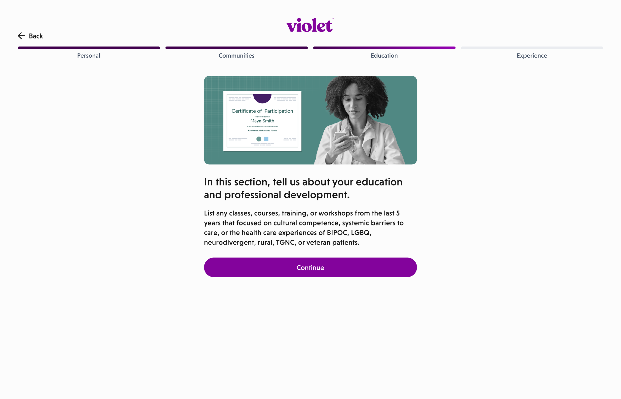
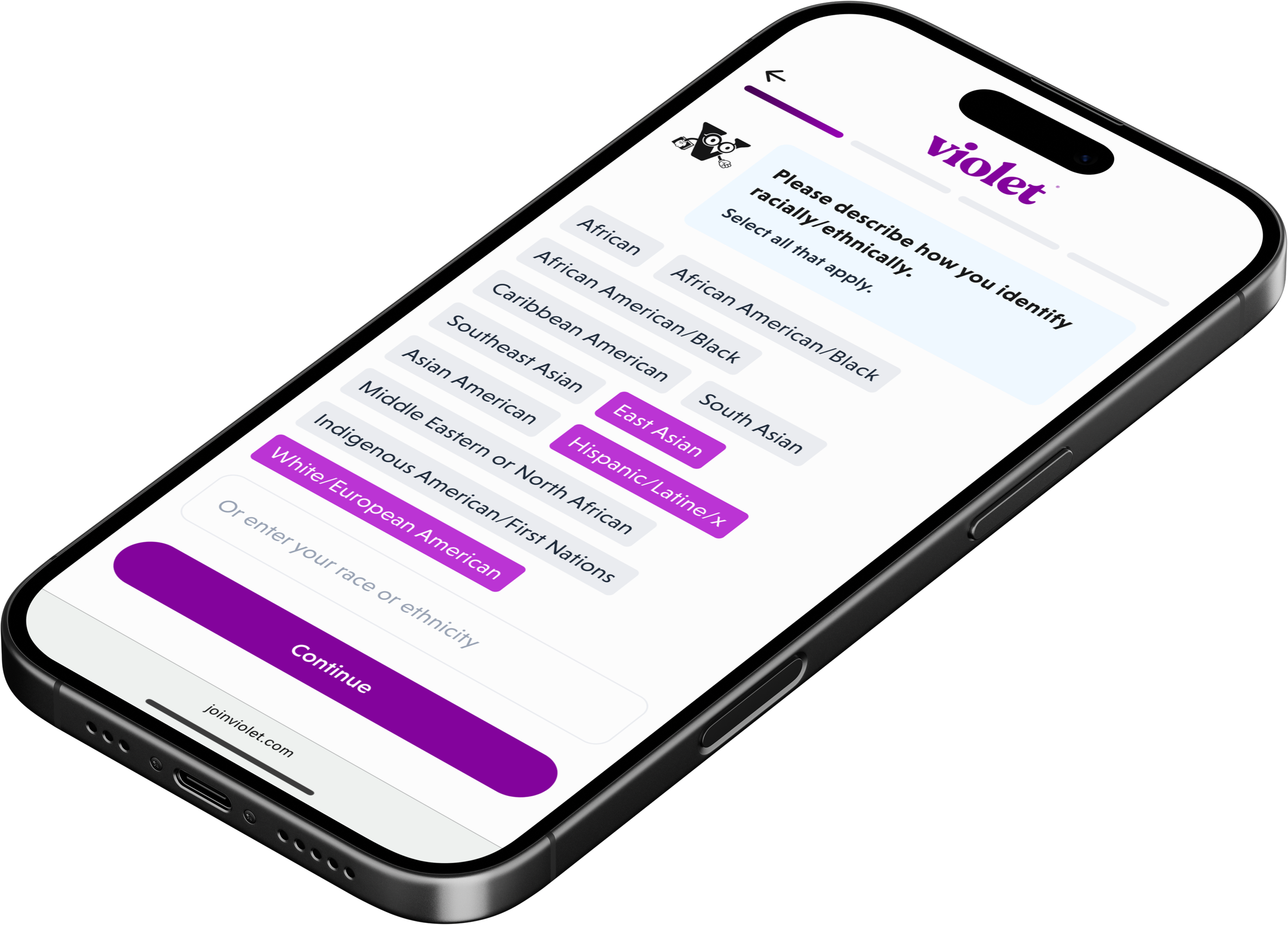
Violet’s mission is simple but ambitious: make healthcare equitable. To do that, the platform measures how providers show up for real people (LGBQ and TGNC patients, BIPOC communities, and soon neurodivergent, rural, and veteran populations). By surfacing strengths, needs, and disparities, Violet turns invisible experiences into actionable intelligence, then equips providers with CE/CME-accredited training to actually improve care.
As Product Design Lead at Violet, I work at the intersection of health equity, data intelligence, and user experience, designing for a world where every person is seen, understood, and supported.
Overview
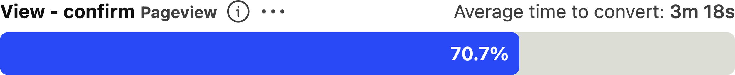
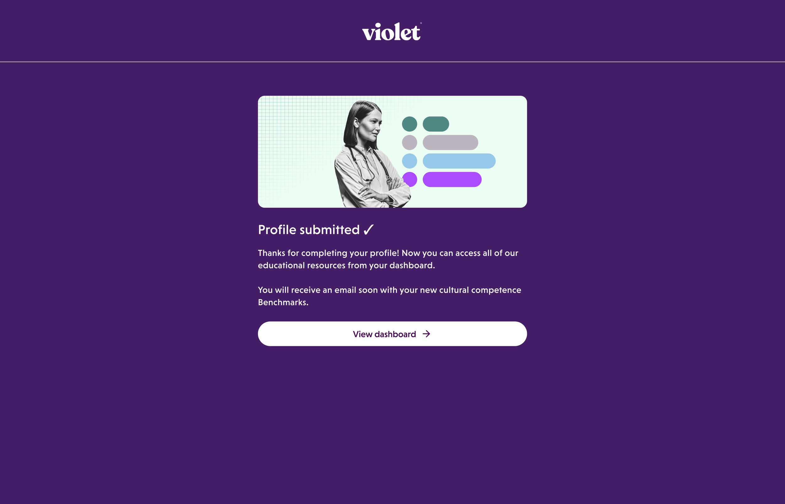
Almost 30% of new users were dropping during onboarding, and it took more than 10 minutes to reach the app. I prioritized fixing this in my second week. Within the first month of launch, data from over 2,200 users showed clear gains: onboarding completion rose 13% and average time dropped to just above 3 minutes. This became Violet’s strongest onboarding performance on record.
ROLE
Product Design Lead
IMPACT
Company reached profitibility in Dec 2025
TEAM
Gaurang Choksi, CEO & Founder
Dr. Kay Nikiforova, Head of Clinical & Research
Russell Taff, Head of Product
Laura Kajpust, Staff Software Engineer
TOOLS
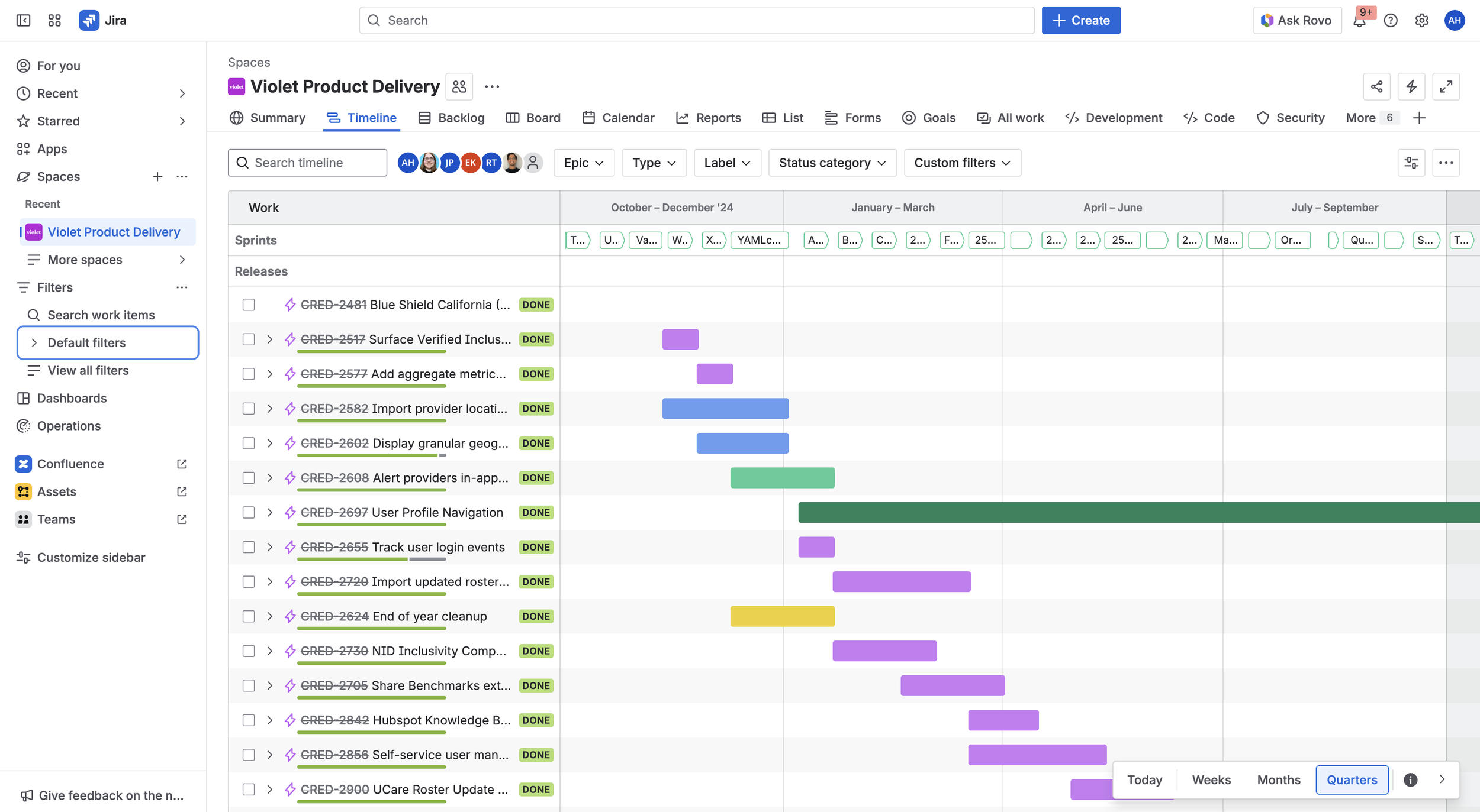
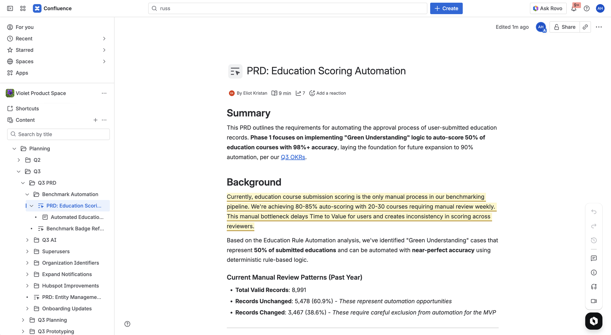
After Effects, ChatGPT, Confluence, Figma, Flora AI, Getty Images, Google Docs, Illustrator, Jira, Lovable, Make, Mobbin, PostHog, Slack, Zoom


When I joined Violet, I didn’t rush into design. I immersed myself in the product, its information architecture, and every piece of existing research. I mapped user flows, analyzed interviews, support tickets, and PostHog data to understand not just what users were doing, but why.

The problem beneath the problem
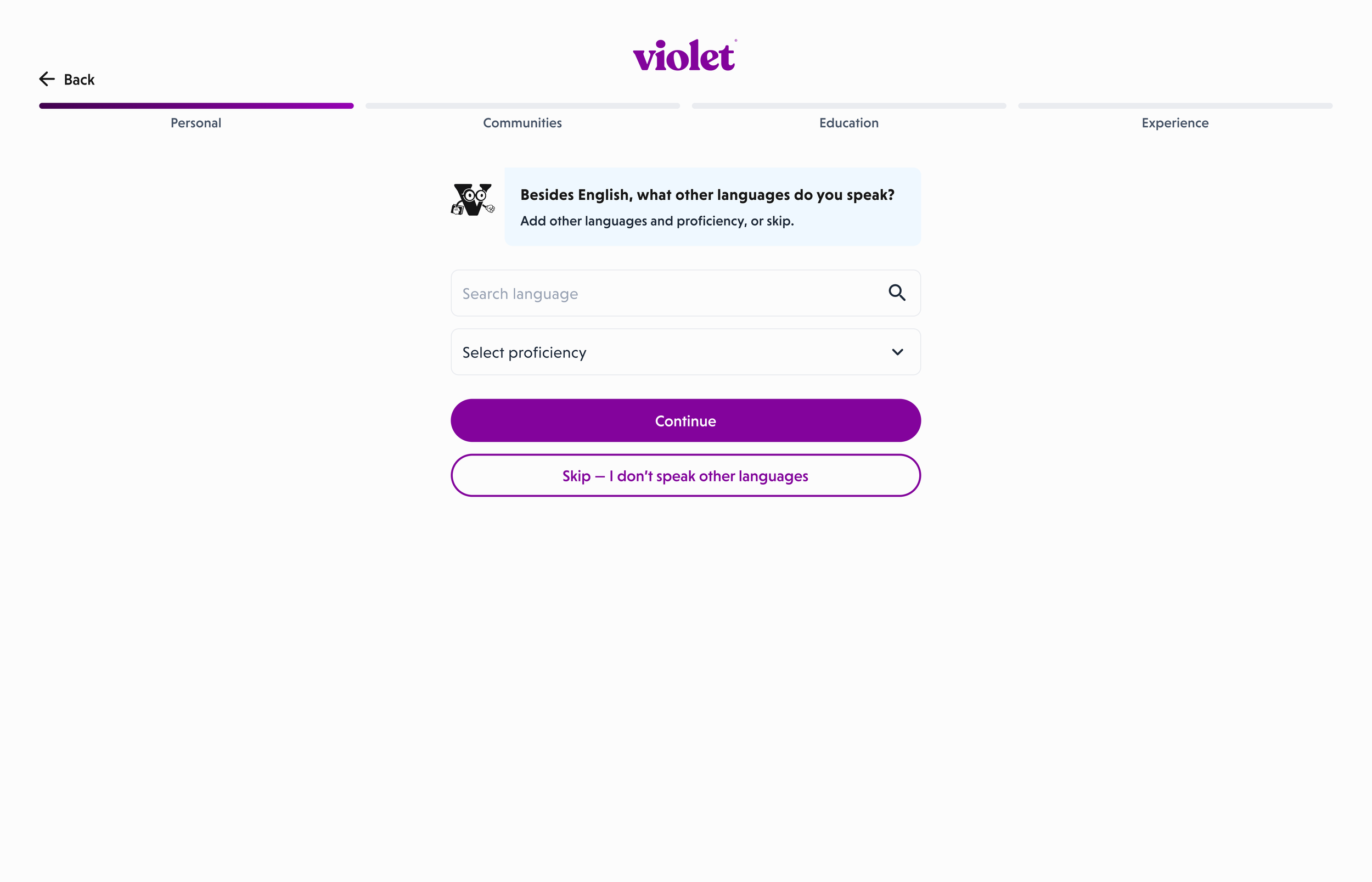
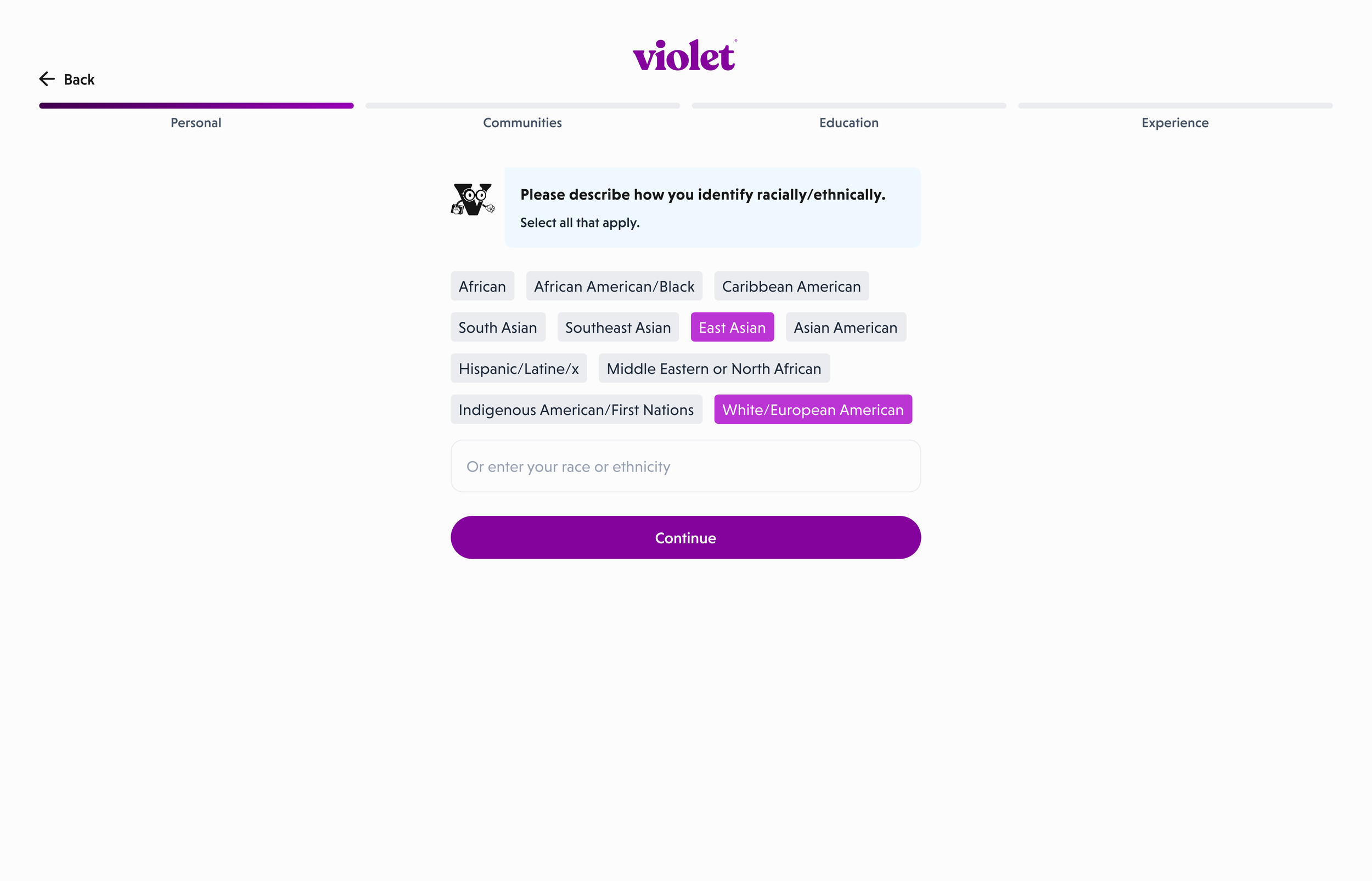
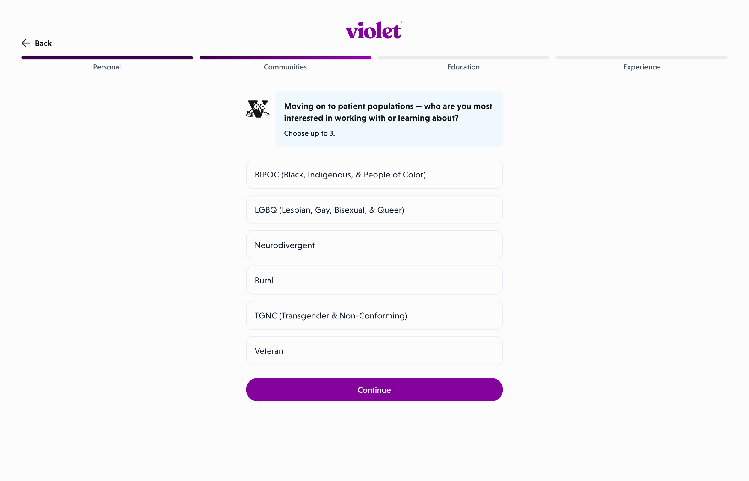
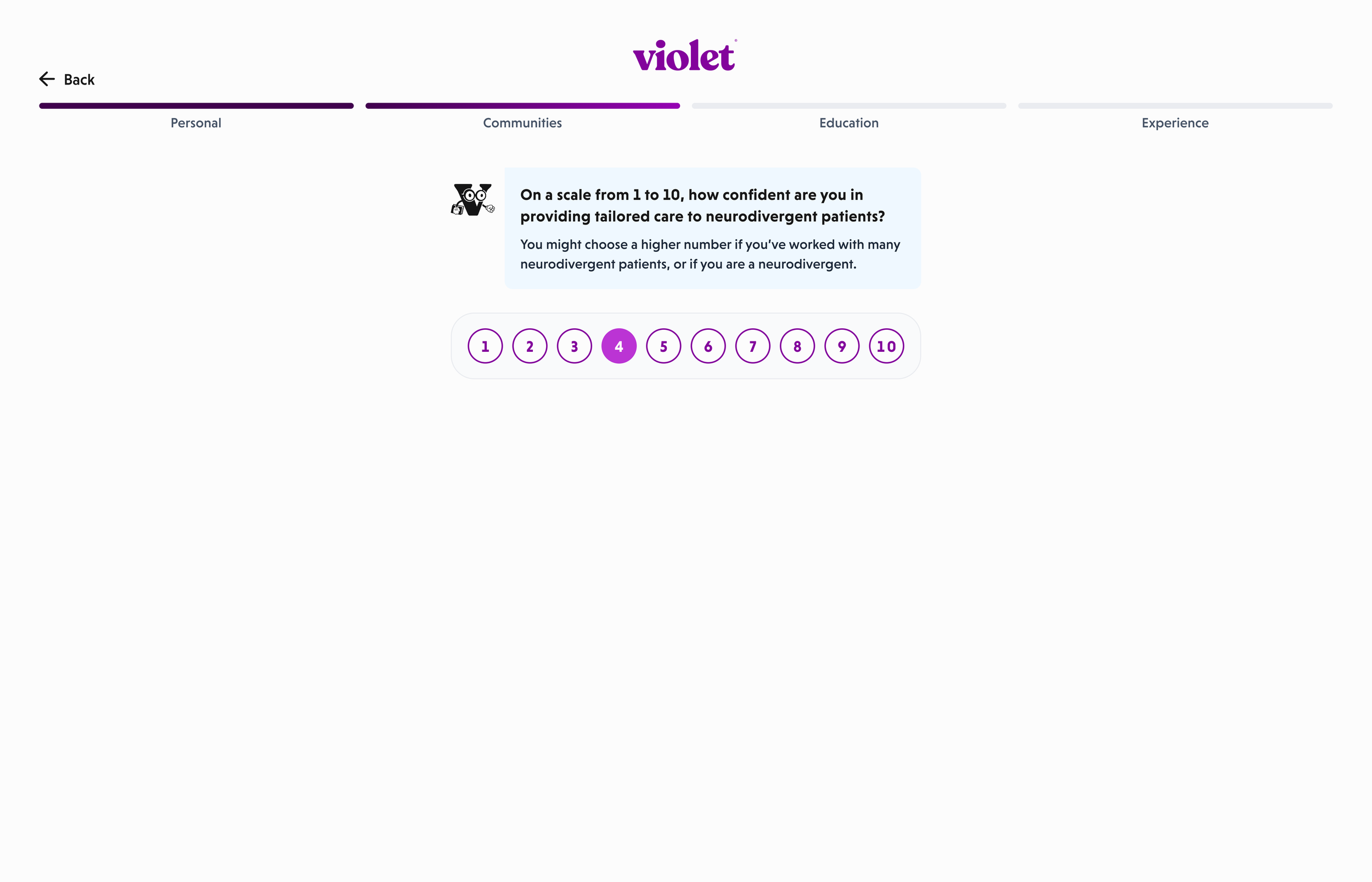
It quickly became clear that onboarding was the biggest point of friction: PostHog showed a 29.3% drop-off before the final step, an exceptionally high rate for an onboarding flow. And the problems were easy to spot:
Clunky copy, with almost every page containing full paragraphs.
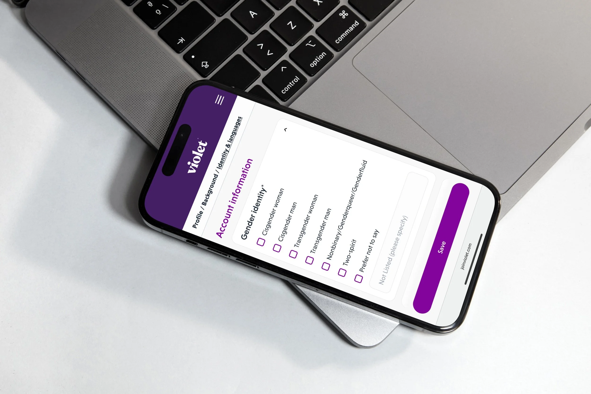
Too many questions, sometimes 10 on a single screen.
Many were irrelevant to user goals or to Violet’s benchmarking.
Important actions were below the fold.
The experience felt like paperwork: functional but lifeless.
As designers, we’re always working within systems. And often, an apparent problem is just a symptom of a macro-problem.
Defining what matters
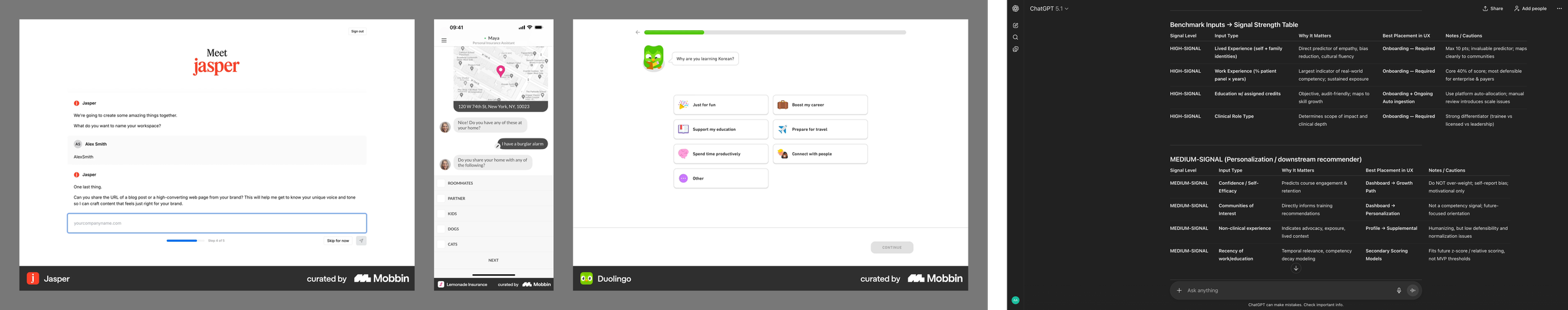
I used Mobbin to quickly explore onboarding patterns from products that had already solved similar problems at scale. Because of Violet’s scoring model, onboarding needed to collect meaningful cultural data without overwhelming users.
I used ChatGPT to analyze our documentation and cluster questions into:
High-signal items to drive personalization
Medium-signal items to move into the dashboard
Low-signal items to remove
I reviewed this structure with our Head of Research to ensure the approach was practical and methodologically sound.
Once we knew what to ask, the challenge became how to ask it.
The first obstacle → AI or intentionality?

The Head of Product wanted onboarding to feel modern and saw an LLM-driven conversational UI as the direction.
I explored both:
AI-generated onboarding: fluid but unpredictable
Structured guided flow: clear and user-centered
I asked one core systems question: Is this solution helping the user answer a need or are we just adding novelty?
(“People don’t need a vase; they need to display flowers.”)
After presenting both paths, I made my case: AI here created too much room for error and wandering, and ultimately complicated the experience.
He agreed: first win.
Resistance & change management
Just a few weeks into my role, I presented this direction to the wider team and got serious pushback. Many were emotionally attached to the existing flow.
Instead of defending pixels, I explained intent:
Why users were dropping off.
How other products, like Lemonade and Duolingo, achieve delight without sacrificing clarity.
How every question must serve benchmarking, personalization, or user value; otherwise, it’s noise.
This reminded me of Nancy Lublin’s approach: ban vague reactions and encourage thoughtful feedback. After that meeting, alignment didn’t come from agreement. It came from understanding.
Second win: real buy-in.
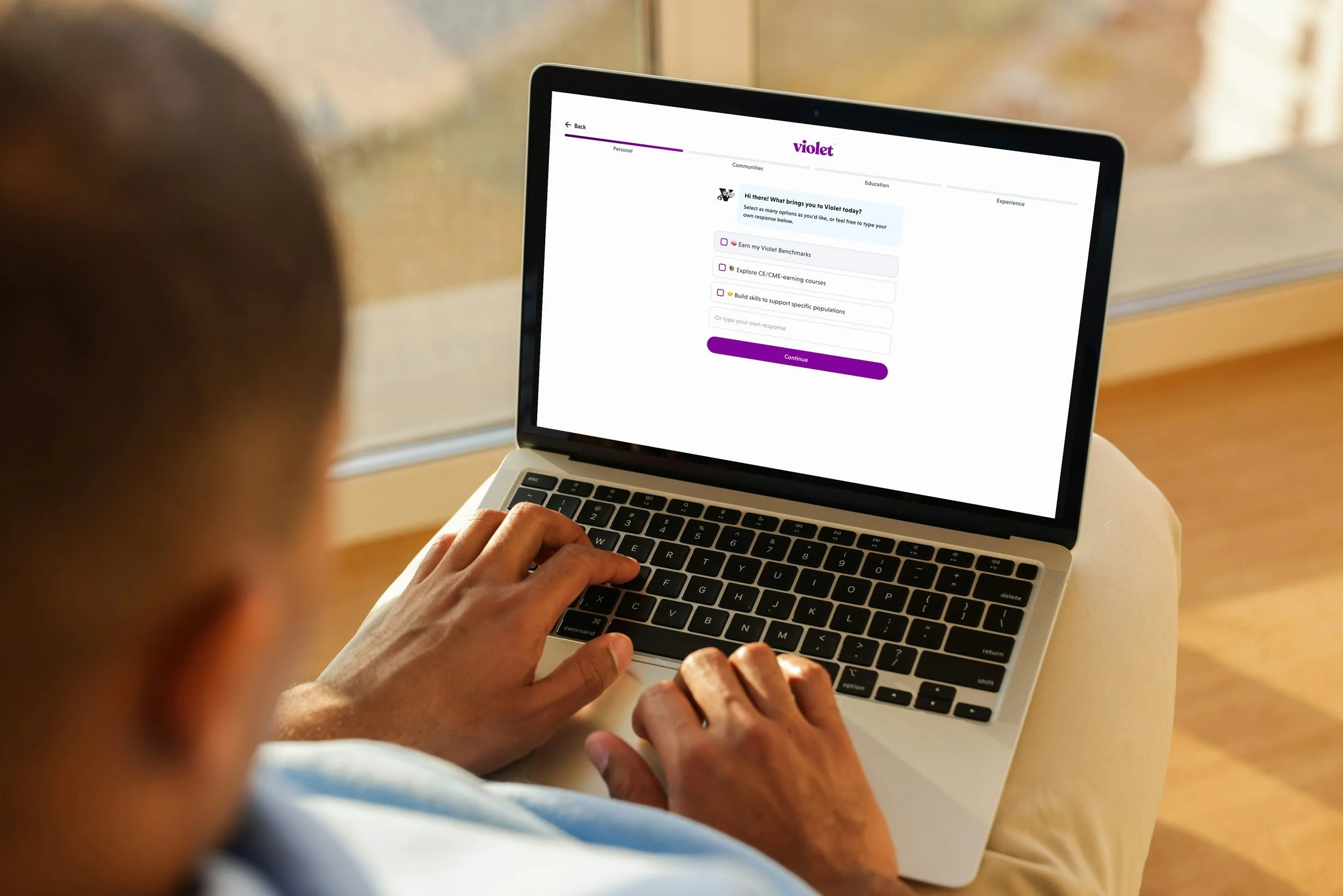
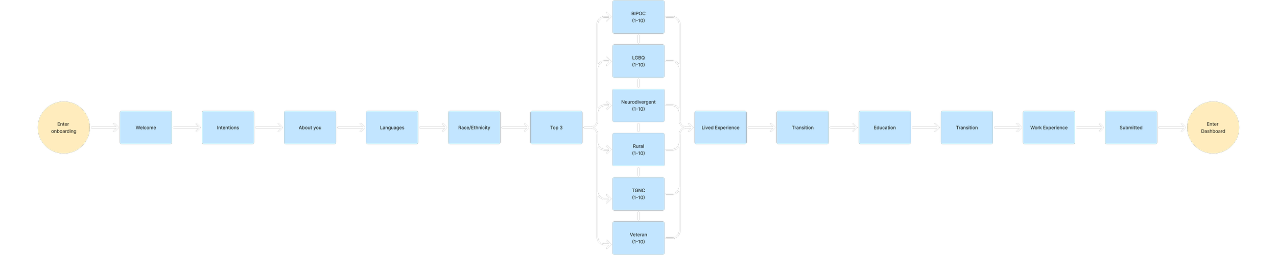
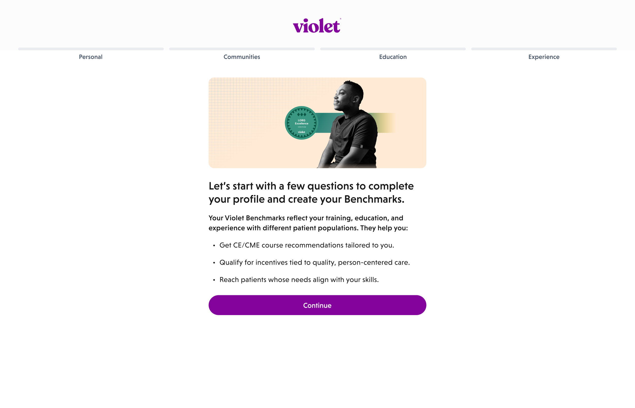
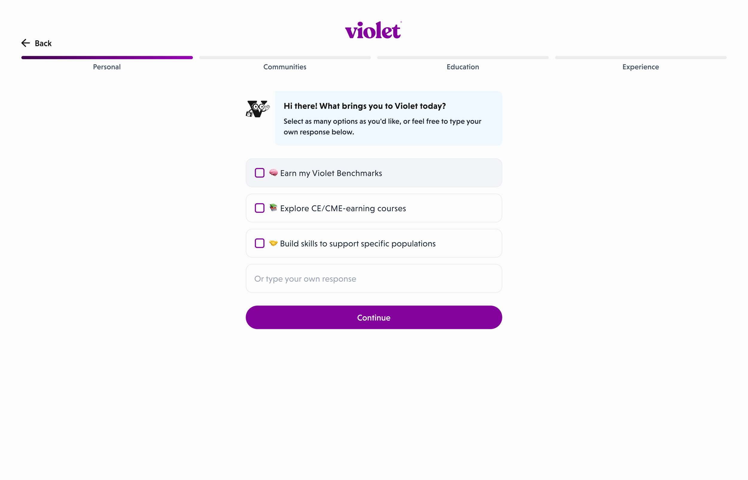
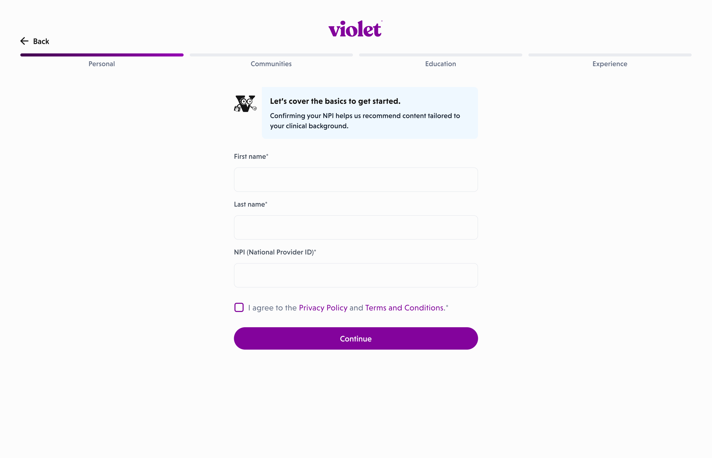
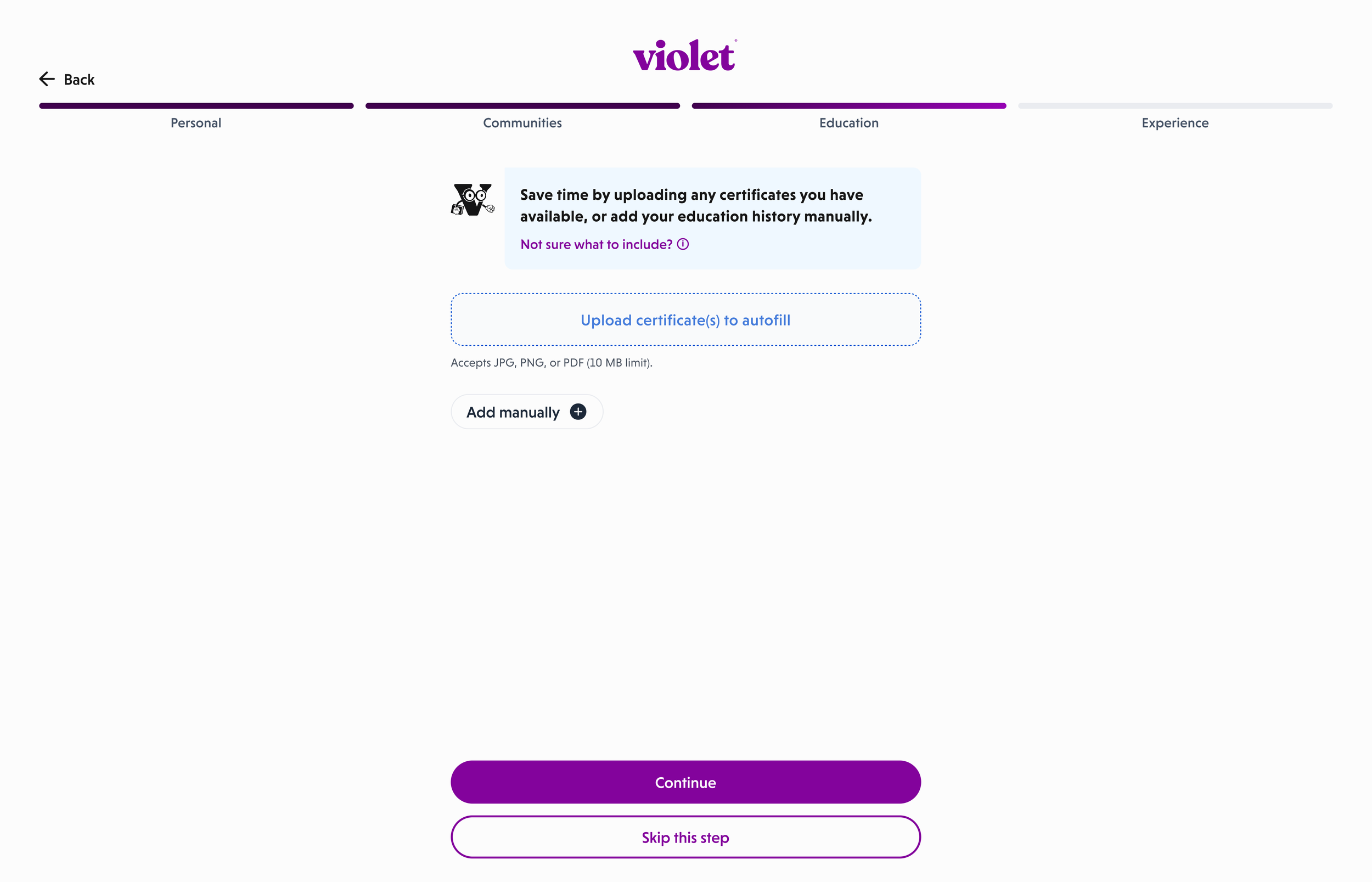
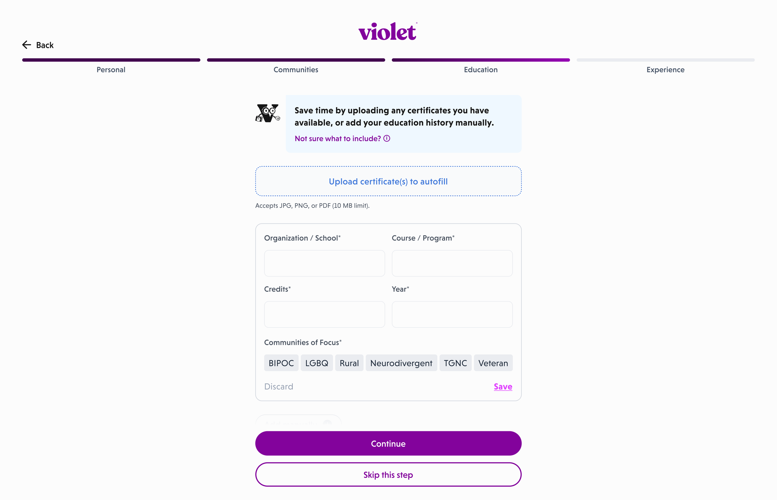
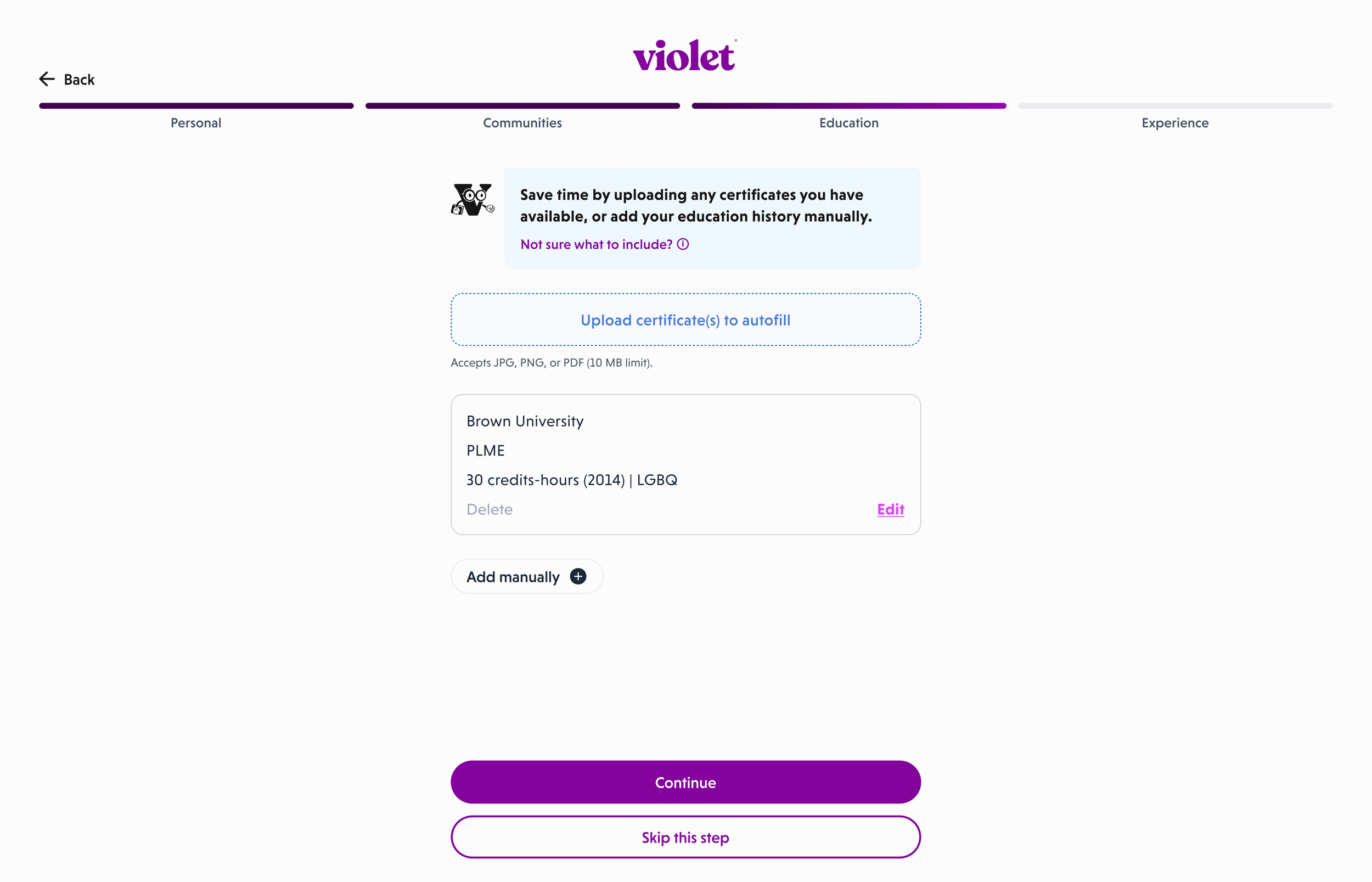
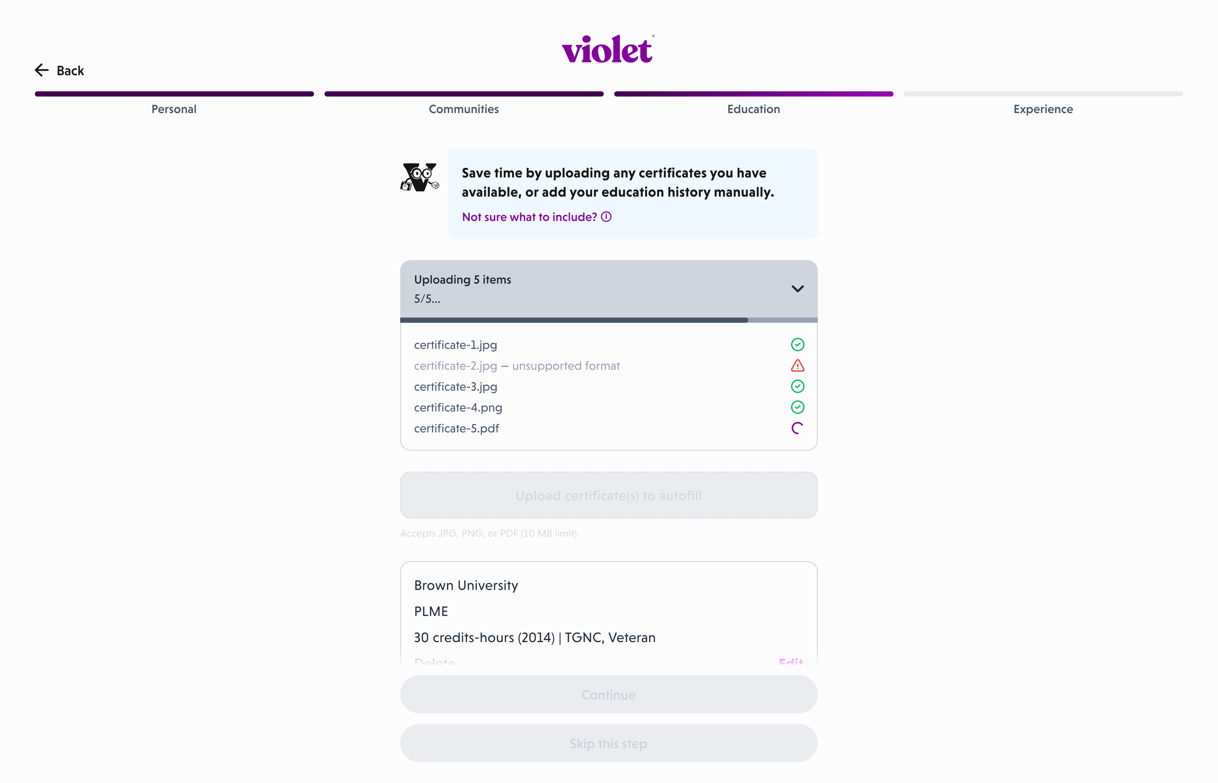
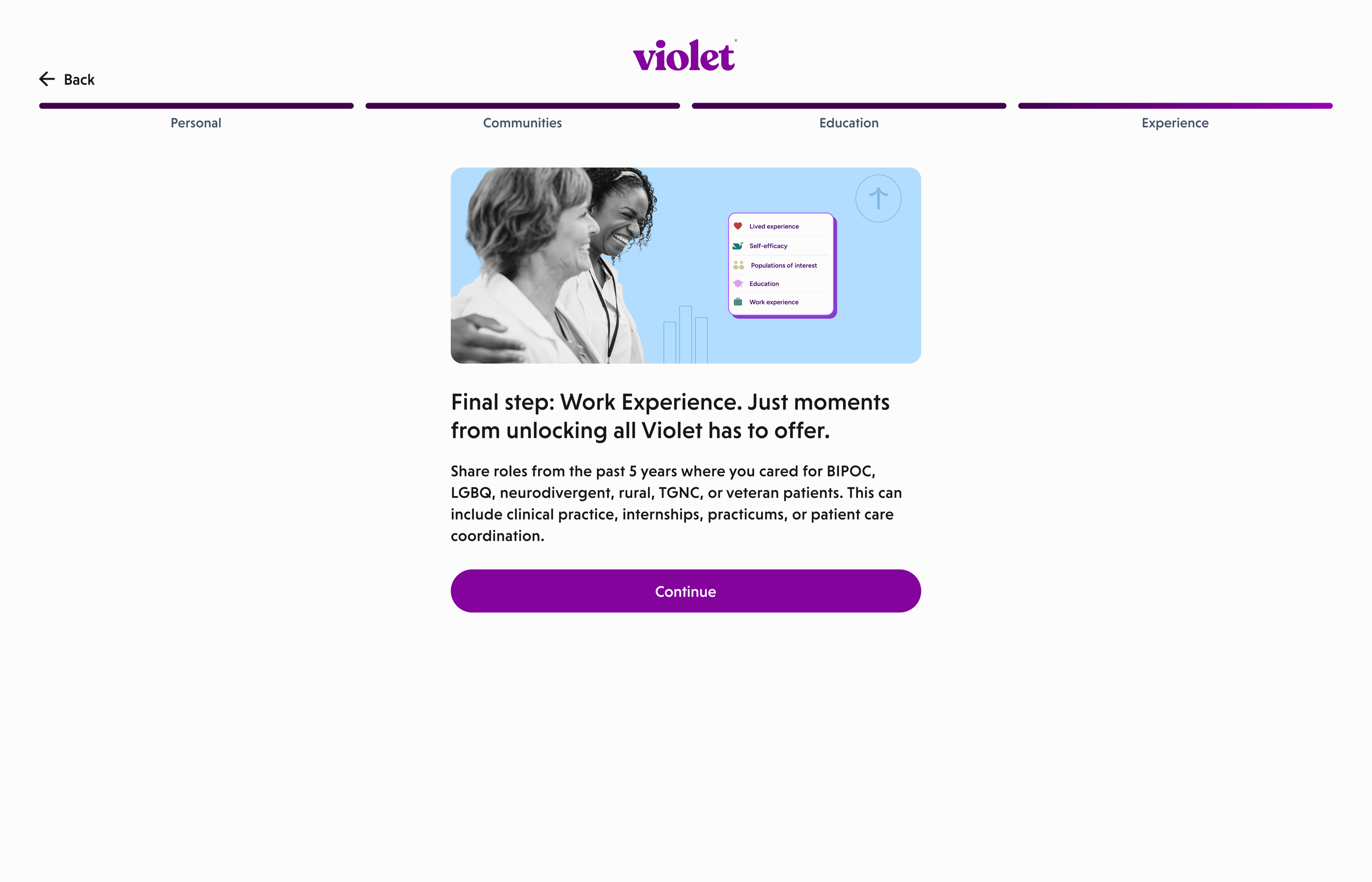
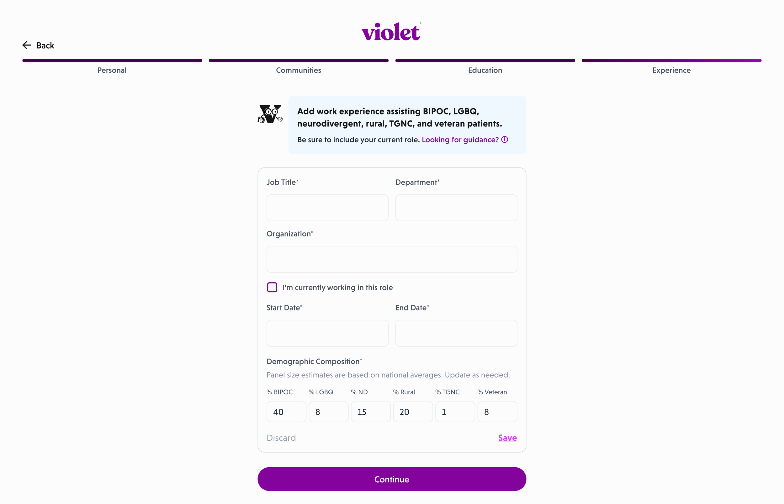
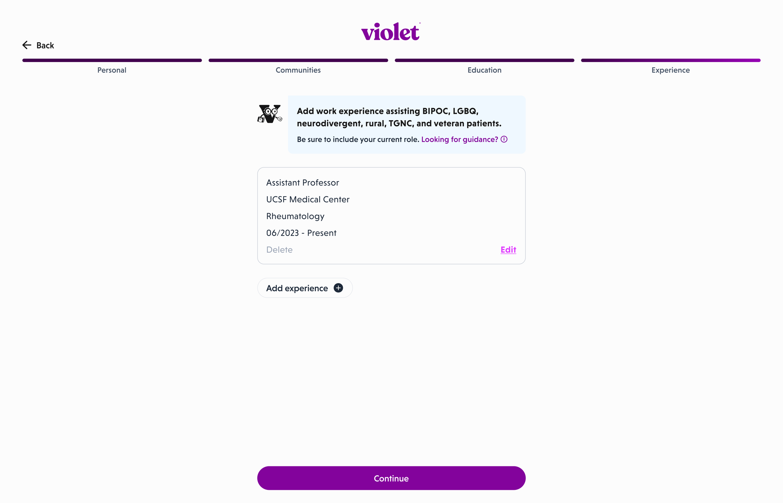
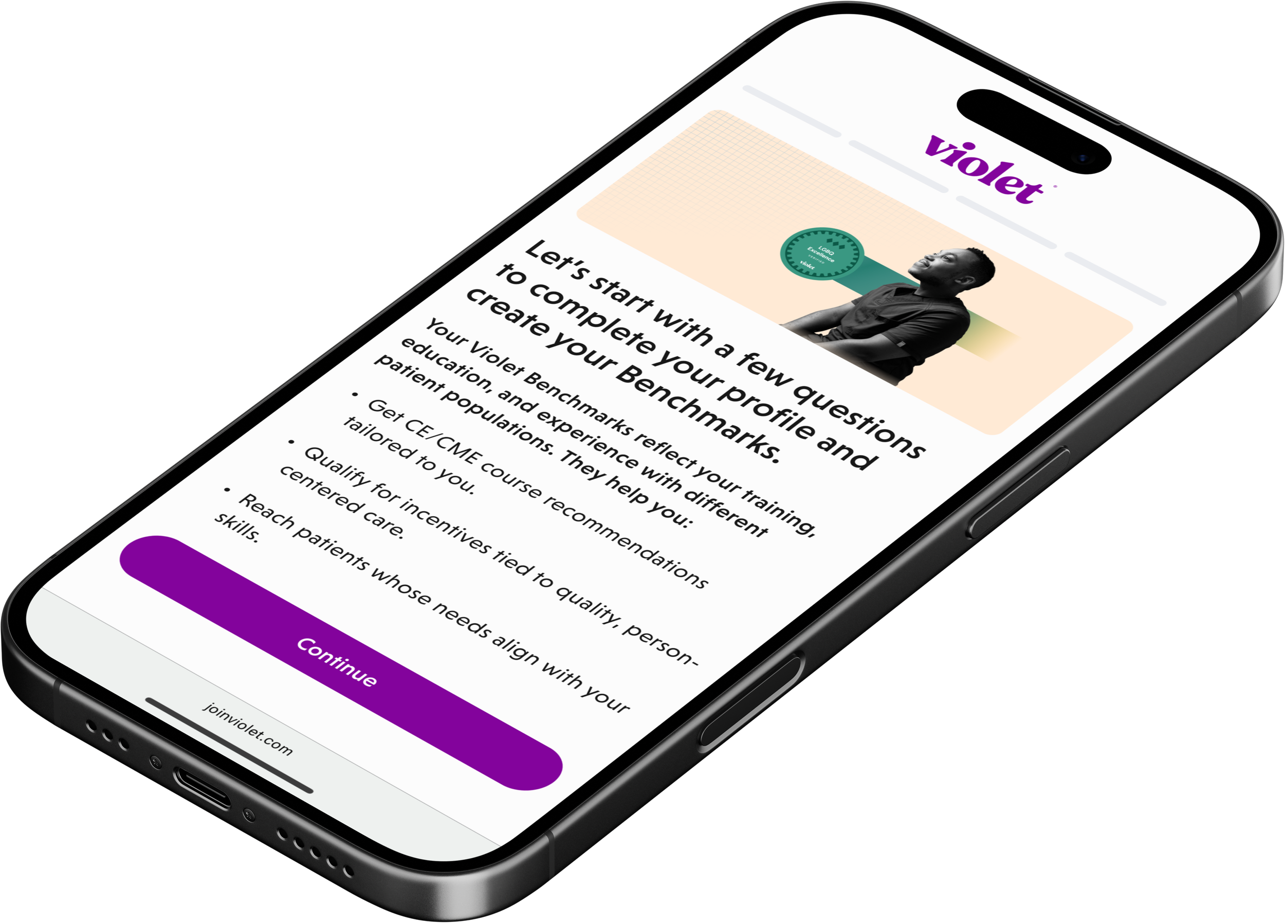
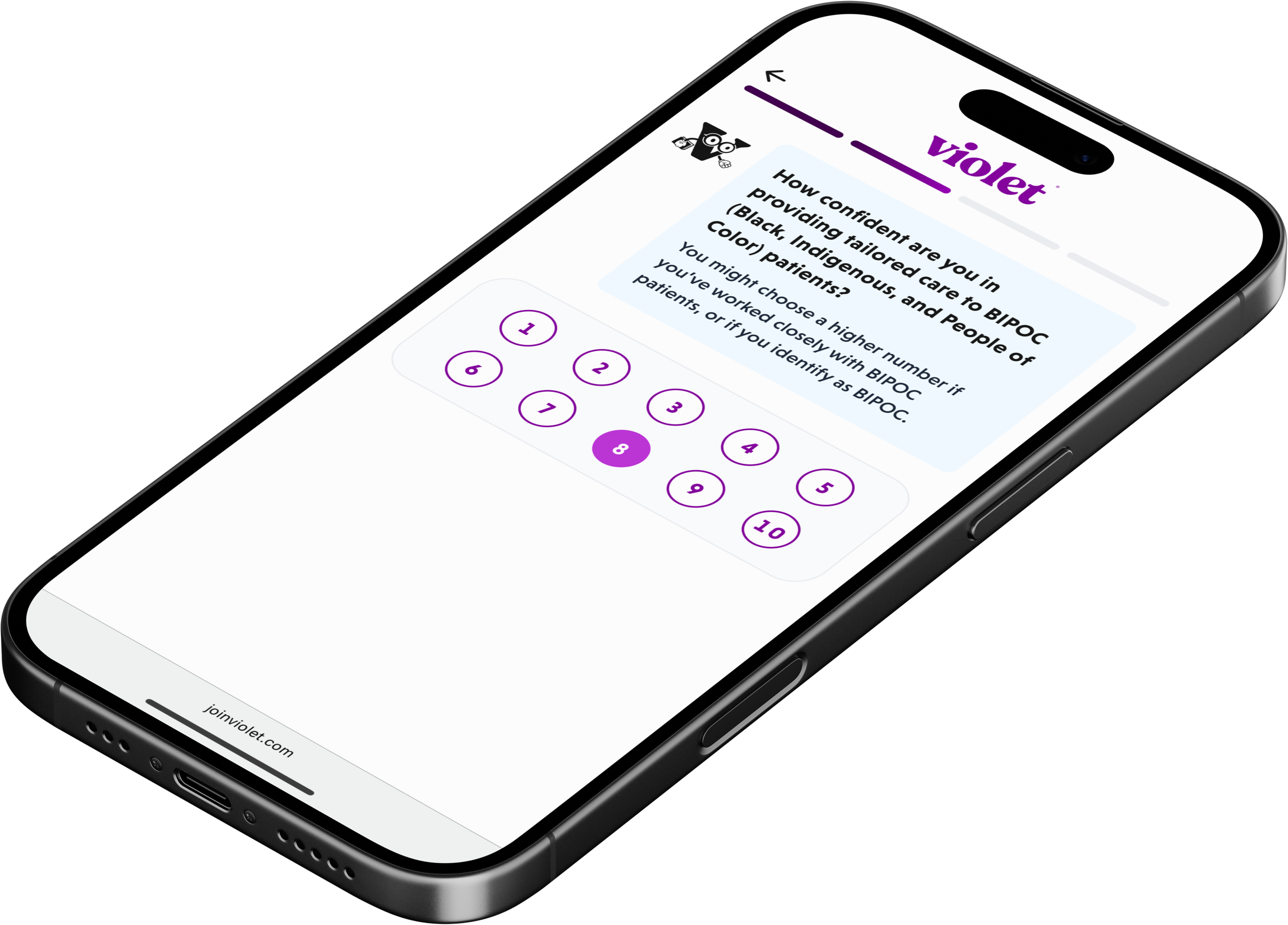
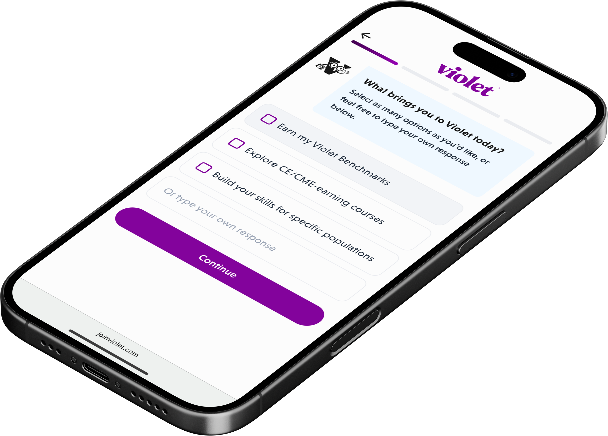
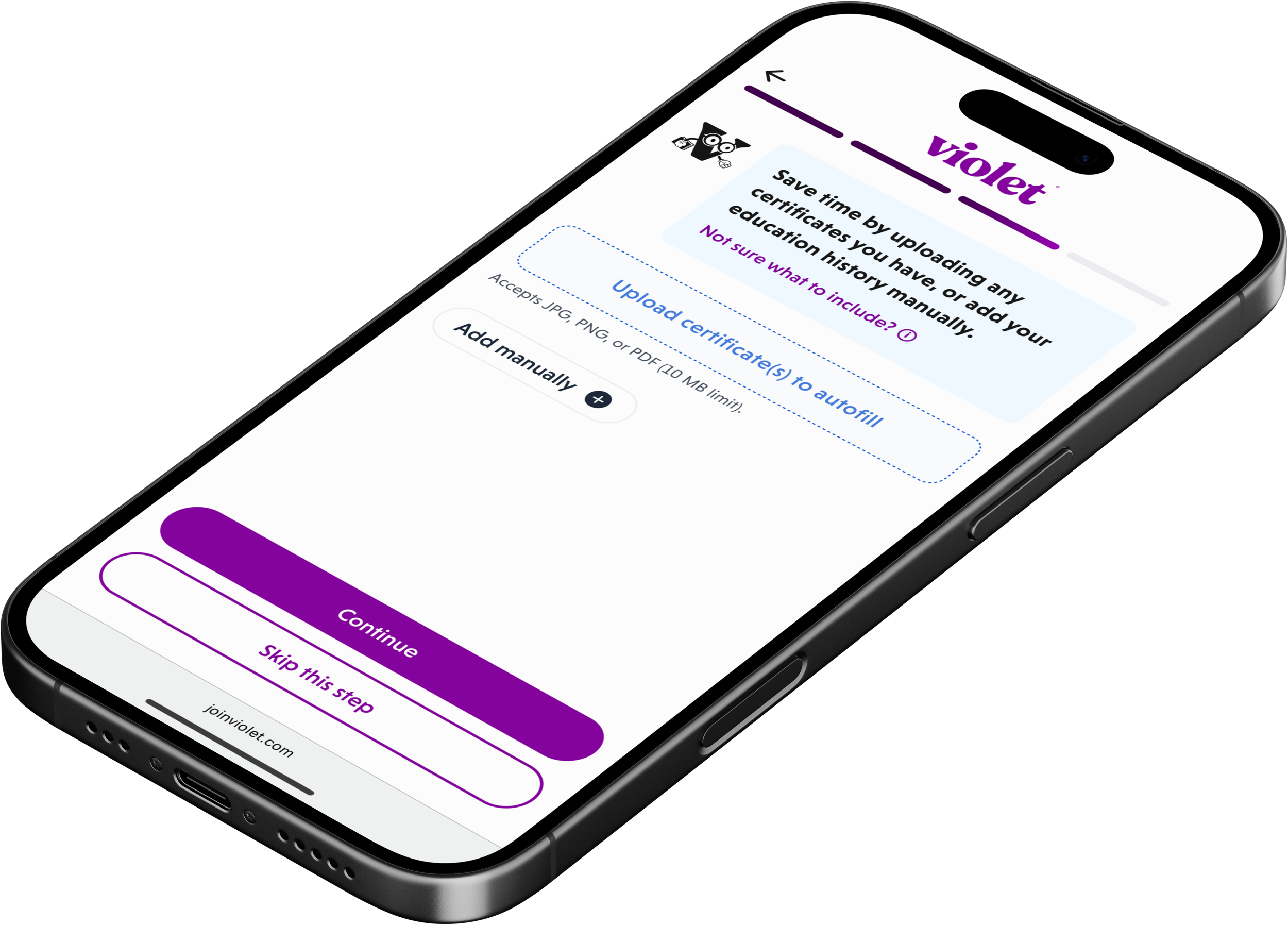
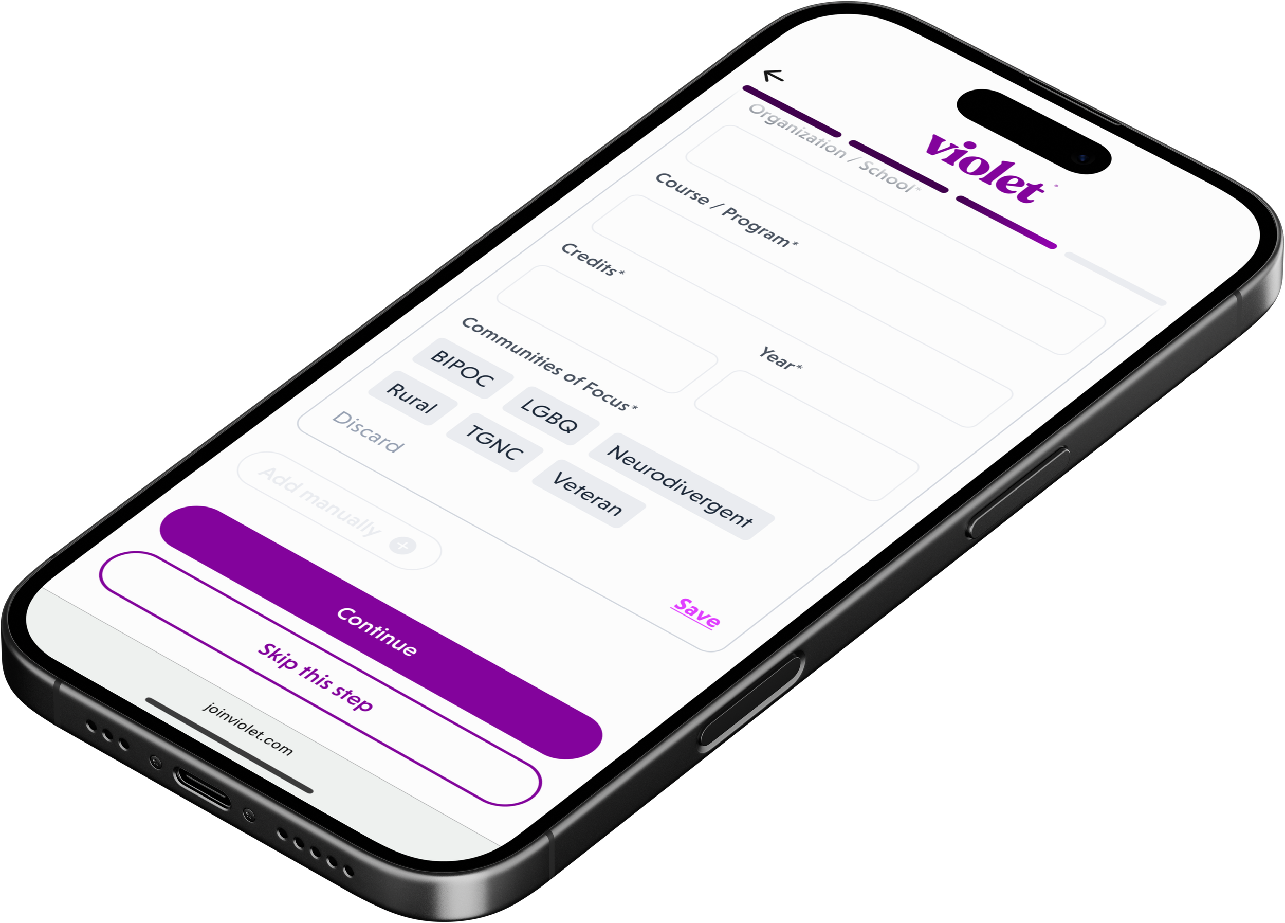
With this aligned, I locked the key screens around a single goal: make onboarding quick, adaptive, and conversational. Using Figma Make and Flora, static forms became a chat-style UI that kept users moving, with friendly language and dynamic branching that surfaced depth only when it mattered. I zeroed in on the work experience section, historically the biggest drop-off point, and introduced contextual defaults to reduce cognitive load and effort.
Micro-interactions and subtle moments of delight transformed a tedious questionnaire into a human conversation.


Outcomes first
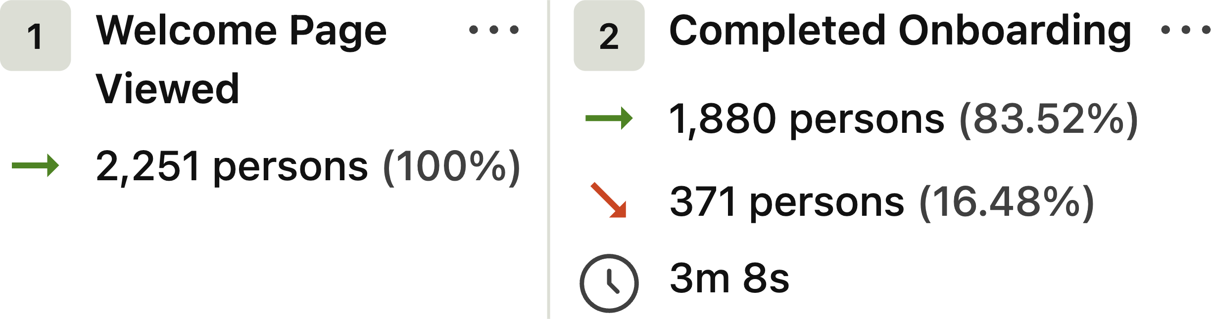
Before diving into the high-fidelity designs below, I want to start with what the work actually accomplished. Within the first month of rollout, data from over 2,200 users showed a clear shift.
Onboarding completion increased by roughly 13%, translating into a 20% lift in retention.
Average time to complete the flow dropped from over 10 minutes to just above 3, dramatically reducing friction and accelerating activation.
These became the best metrics Violet had recorded in such a short window, and any lingering skepticism quickly faded.
But we didn’t get everything right; and the work experience segment, historically responsible for roughly an 8% drop-off, improved but still needs refinement. We’re tightening language and exploring alternatives to the traditional form layout. All in all, real progress with a clear path forward.

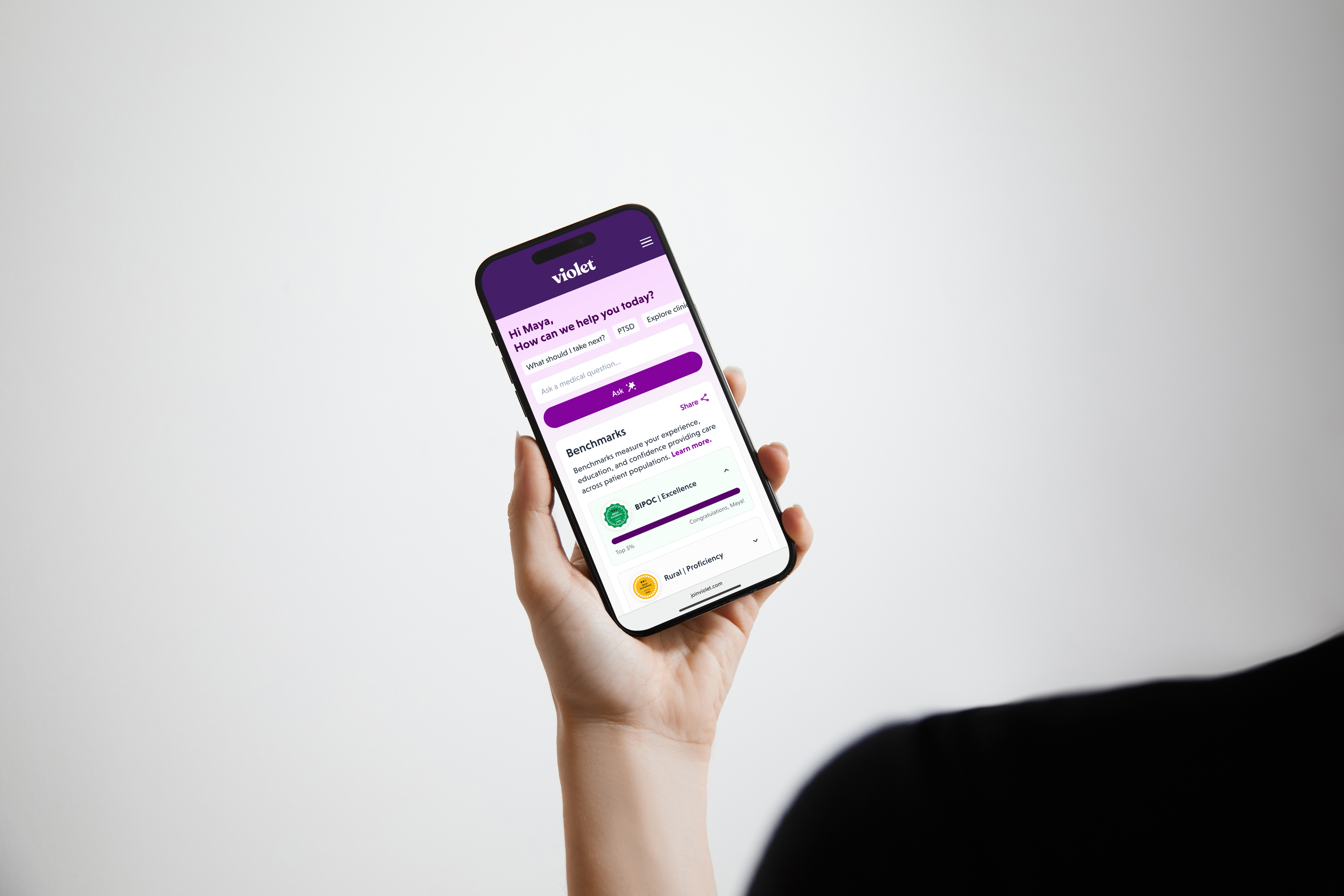
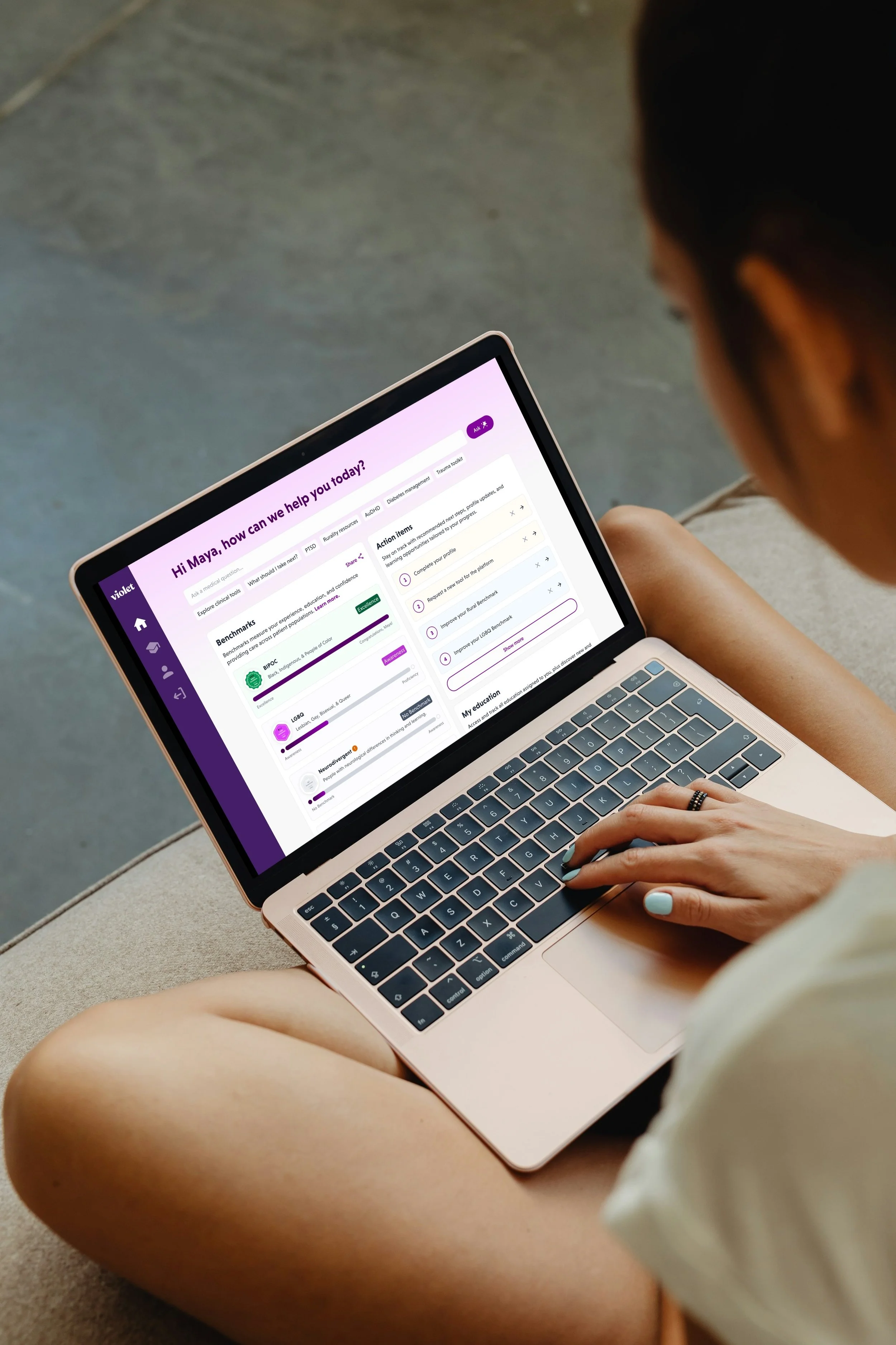
With onboarding nearly stabilized, I shifted to redesigning a core part of the experience: the main dashboard and provider profiles. Building nearly everything in Claude Code, I rapidly prototyped a new dashboard experience and AI clinician assistant. We moved the platform from a passive information hub into an actionable guidance system by improving hierarchy, surfacing high-value features, expanding support for three new clinical communities, and helping providers understand what to do next.
The goal was a more engaging product surface that drove activation, unlocked educational offerings, and delivered value from the very first session.